After reading the “You and Your Research” speech by Richard Hamming, I have been asking myself, “What are the important problems in biostatistics?”
After a few minutes, I have come up with the following list:
- Integrating Bayesian and Frequentist methodology
- Statistical methods that: (1) require little computation time; (2) need little memory; or (3) both
- Causal inference in both observational studies and clinical trials
- Fisherian vs. Neyman-Pearson inference
- Reproducible research
The thought also occurred to me: do we really have big problems? I view a huge part of biostatistics as the nuts and bolts of answering big questions in medicine and public health. We don’t necessarily have to have big problems of our own to help solve big problems.
Thoughts?
Edit. Here is a stackexchange forum on this question for statistics: http://stats.stackexchange.com/questions/2379/what-are-the-big-problems-in-statistics
Our department just had an excellent journal club about the use of Bayesian methods in clinical trials. The ensuring discussion raised some questions about the use of Bayesian and Frequentist methods in clinical trials.
The debate
One professor raised the point that a phase 3 trial should represent stand-alone evidence that a treatment works (or that we can’t conclude that it works), and therefore should not include any prior information in the tools used to analyze the data (regardless of whether the tools are Bayesian or Frequentist). I am assuming that the Bayesian argument (which was not as vocal) would be that scientists should use all prior information available to more efficiently estimate treatment effects in a clinical trial (regardless of the phase of the trial). This improved efficiency would hopefully result in exposing as few patients as possible to potentially worthless drugs that have side effects, or drugs that are harmful, as well as decreasing the amount of time that a good drug needs to get to market.
One very helpful point that a professor raised was that there were two topics really being discussed: (1) taking prior information into account (which can be done with Bayesian or Frequentist tools); and (2) are Bayesian or Frequentist tools better for taking prior information into account, in the context of determining treatment effects of drugs.
Questions that need answering:
After thinking about these topics, I have come up with several questions whose answers might inform the use of Bayesian methods in clinical trials:
- Is previous information implicitly used in all clinical trials? (The FDA usually requires two independent studies that establish a significant effect of treatment to approve a drug. The fact that the first trial [or second trial] was even conducted is a result of previous information that indicated a significant effect of the drug could potentially be found.)
- If the answer is “yes,” then what kind of effect does that answer have on estimates/intervals/hypothesis testing in Phase 3 trials analyzed with Frequentist tools, and the final decision about whether a drug has an effect after both trials have been conducted?
- If there is an effect of implicitly assuming information about previous results, then would Bayesian or Frequentist tools be better to take this prior information into account?
- Perhaps a question that should be asked first is: does the use of methods that take into account implicitly assumed information (i.e., making implicit information explicit), regardless of the tools used to do so (Frequentist or Bayesian), affect the inference/estimation of a treatment effect compared to not taking into account the assumed information?
- Is there a difference in how well doctors and/or patients interpret the results of a Phase 3 trial analyzed using Bayesian tools versus results of a Phase 3 trial analyzed using Frequentist tools?
- This information would let us know whether the argument that “Bayesian tools use probability in a more intuitive way” is tenable.
I think the answers to these questions would clear up a lot of the debate about using Bayesian methods in clinical trials, especially in phase 3 trials. I look forward to comments on this post.
Having begun my reading about spatial statistics, I have naturally started Applied Spatial Statistics for Public Health Data (2004) by Waller and Gotway. One of the concepts brought up in the beginning of the book is the ‘ecological fallacy,’ which describes the phenomenon that the relationship between 2 variables can change depending on the level of data aggregation you use. Epidemiological concepts like this are counterintuitive, and so I usually have to prove to myself that they are true. In this case, I use simulated data to do so.
I was interested in the relationship between variables Y and Z. I assumed that there were 100 values for Y, which are independent and identically distributed (iid) as standard normal. To create a correlation with Z, I made Z a sum of Y and another iid standard normal random variable, A. Thus, Z = Y + A.
I calculated the correlation between Z and Y. Then, I took the same 100 observations for Y and split them into 10 groups of 10 observations. A mean value for Y was calculated in each of the 10 groups. Then, a new value for Z was calculated, which was the sum of these 10 means, as well as the first 10 values of A that were generated. The correlation between the new value for Z and the 10 means for Y was then calculated and compared to the correlation produced from the individual-level data.
Code
y<-rnorm(100)
ind<-seq(10,100,10)
y.mean<-length(ind)
for(i in 1:10){
begin<-(i-1)*10+1
end<-i*10
if(i==1) x<-y[1:10] else x<-y[begin:end]
y.mean[i]<-mean(x)
}
a<-rnorm(100)
z<-y+a
z.mean<-y.mean+a[1:10]
cor(y,z)
cor(y.mean,z.mean)
Results
The correlation for the individual-level data was 0.71, while the correlation for the aggregated, mean data was 0.54. These two correlations were estimated from the exact same random numbers for Y, A, and Z. Graphs of the values for Z and Y, in each situation, are shown below.
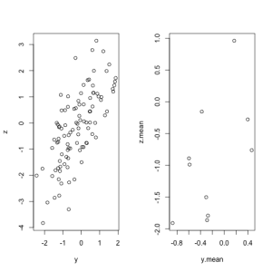
Conclusions
The ecological fallacy can produce vastly different estimates, and sometimes inference, for the exact same individual-level observations. It is important to remember the limitations of aggregated data and their application to inference about individuals.
I have my first two papers in the pipeline, and one common element is a schematic as a figure (one is detailing an experimental design, and another is a flow diagram of exclusion criteria). Because these figures have image resolution requirements from the journal (usually 300 dpi or more), some sort of image manipulation program is necessary (e.g., GIMP). However, I find working in such programs to be difficult for me, as I do not have a design background. Even selecting a portion of a layer can be difficult. So, here is the workflow I have developed so far:
- Design the schematic in Powerpoint, using whatever font is required by the journal. You can also set the slide size to fit within the figure size requirements.
- Save the file as Powerpoint file (so you can edit later), and also as an image (*.png).
- Open the image file in GIMP.
- Go to the “Image” tab and select “Scale Image…” from the drop down menu.
- Click each “chain” to the right of the measurement windows, as this will prevent GIMP from changing the size of the image when you change the resolution.
- Set the X and Y resolutions to be anything you want (e.g., 300 ppi).
- Save the image.
- Insert the image into your Word document, or import it into a LaTeX file.
This workflow has seemed OK so far, but there are some problems:
- I have some reservations about whether ppi and dpi are the same thing, and I have had trouble finding literature on the internet that clearly explains the difference.
- I am not positive whether setting 300 ppi on both the X and Y axes in GIMP produces a 300 ppi image, but the final image looks really clear and is probably acceptable to journals.
- Powerpoint will sometimes make perpendicular lines that don’t meet perfectly at corners, or lines extending from circles that don’t seem perfectly straight. GIMP is more reliable at this, but also more difficult to use.
Does anyone have any suggestions? What workflow has worked for you? As a biostatistician, I will likely be making schematics like the ones described here in almost every paper, so I need to learn how to make them well.
One of ideas that’s been bouncing around in my head during graduate school is making an app that helps decide which statistical design is most appropriate for a given problem. For instance, imagine a physician/researcher wants to determine whether the outside temperature had an relationship with the likelihood that his patients would live or die on the surgery table. (A silly example, I know, but it is just an example.) He could likely determine that what he’s really interested in is whether the patient dies (outcome), as determined by another variable, temperature (predictor variable). A simple app might be able to point him to logistic regression. If he knows how to do one, great! If not, the conversation with the statistician would likely go more quickly.
So, what I’d like to know is what people think about designing an iOS or Google Chrome app that would be a kind of “decision tree” for arriving at the appropriate analysis. I imagine a Google Chrome app could even have the “leaves” of the tree be screen casts of how to perform the analyses in R. This exercise would be a good one for me, as I am still in my statistical training, and I believe that many people would pay $0.99 if the app worked very well.
Thoughts?
I have not posted in a long time, mostly due to my upcoming qualifying exam. We are now on the eve of the theory section. As I look back on the past 18 months of graduate school, I realize how far I have come. While we constantly compare ourselves to others who are farther along, have more talent in particular areas, or simply work harder, we can forget that what really matters is whether we have improved or not. I definitely have. Graduate school has been the first time I’ve had to spend 6 months working on skills without any visible improvement. Then, without warning, comprehension strikes.
I am hoping it strikes tomorrow. I have taken extreme efforts (including retaking my Theory 1 course) to prepare for tomorrow. If graduate school has taught me one thing, however, it is that persistence where you have previously failed is a valuable trait. Not only do obstacles tend to fall when you least expect them, but you gain respect from those around you. I think part of that respect comes from their knowledge that you would “stay in the trenches” with them were you to work together.
So, hopefully tomorrow will be a victory. If not, there will be a second chance in seven months.
I am not afraid to fail.

The central limit theorem states that regardless of the original distribution of the data, the sample mean of n independent observations will approach normality as n goes to infinity. This theorem allows scientists to use the plethora of statistical tests that exist which contain a normality assumption. For instance, the t-statistic consists of a normal random variable divided by the square root of a chi-square random variable divided by its degrees of freedom. The t-test can be applied to many samples that are not normally distributed because their mean, as the CLT says, is approximately normal.
I have often wondered, though, how much is enough? Many textbooks and professors will say 20, 30, or 50. However, I could find no formalized guidelines that justified these numbers. So, I have done some rough simulations to provide a reference for when the CLT “kicks in,” depending on the original distribution. In reality we do not often know the generating distribution, but the general shape of the distribution might indicate what common distribution it is similar to.
Here is the code for the simulation, done in RStudio (0.94.84):
x<-matrix(nrow=1000, ncol=100)
for(j in 1:100){
for(i in 1:100){
x[i,j]<-mean(rnorm(50))}
temp<-shapiro.test(x[ ,j])
if(temp$p.value<=0.05){print(temp$p.value)}}
The above code will perform the following tasks:
- generate 50 observations from a normal (or any distribution with finite variance) and calculate a mean. This process is repeated 100 times, generating 100 means
- A Shapiro-Wilks test is used to ascertain normality. Then, this entire process, including step 1, is repeated 100 times. We now have the results of 100 Shapiro-Wilks tests, each of which tested the distribution of 100 means.
- Of the 100 Shapiro-Wilks tests, any tests that had a p-value less than or equal to 0.05 are printed. If about 5 are printed (I’m personally alright with 4-6), then the distribution of those sample means are considered normal (i.e., the test is rejecting at the correct alpha-level).
Now, I provide a list of the samples sizes needed to achieve normality of the sample means. These results were calculated using the above code and starting with a sample size of 5, and increasing the sample size by 5 as needed until normality is achieved. The distributions used are: binomial, poisson, exponential, beta, gamma, chi-square, and t.
- Binomial (size = half of sample size rounded down, probability = 0.5): 20 (4 rejections)
- Poisson (lambda = 2): 20 (4 rejections)
- Exponential (rate=0.5): 140 (6 rejections)
- Beta (shape = 2, scale = 2): 5 (1 rejection)
- Gamma (shape = 2, scale = 2): 120 (1 rejection). However, this value seemed to be an extreme case after replication. After, replication, the more reasonable sample size seems to be 155 (5 rejections).
- Chi-square (degree of freedom = n-1, ncp = 0): 25 (5 rejections)
- t (degree of freedom = n-1, ncp = 0): 10 (4 rejections)
This experiment shows us that while the binomial, poisson, beta, chi-square, and t distributions are all approximately normal at the “textbook” sample sizes, the exponential and the gamma required quite large sample sizes for the means to be distributed normally. This was surprising to me.
This post was my first attempt at a simulation. It is possible that the simulation methodology, or the parameter values for each distribution, were used inappropriately. I invite comments and suggestions on improving the methodology if anyone has criticisms.
After one year in graduate school, I have found using certain computer programs has made my life much easier. I’ll give a list, and describe the uses\advantages of each.
As I stated in a previous post, this program is wonderful for organizing your pdf library. The set up is somewhat like an iTunes library for your journal articles, which can sync across your computers, as well as with the web-component. Additionally, Mendeley has a social networking component. You can see what are the most frequently read papers in your discipline, create groups on a certain topic, and see papers related to the ones in your library. Mendeley will also export your library into Endnote or BibTeX format. All in all, this is one of the most useful programs on my computer.
Especially if you’re planning to stay in academia, learn R. It is a free alternative to SAS and is better suited to programming new statistical methods. Many of the methods coming out of statistical genetics are developed in R, and often investigators will provide their code in supplementary material, or even write a new R package to perform the analysis. Thus, you don’t have to wait for a new version of SAS to perform novel analyses. You can be entering your data into the new analysis function in ~30 seconds.
A GUI implementation of R that I have really enjoyed is R Studio.
It’s a bit difficult to sense the benefit of LaTeX without using it. It is a document-processing language that creates beautiful documents with less effort than it would to create documents of the same quality in Word (or any other word-processor). I learned LaTeX enough to create most of the documents I need to in about 6 months, with off and on effort. I had no one to teach me, so if you can find someone I believe you could be on your way in ~1 hour. Plus, programs like Sweave (a function in R) will allow you to combine your R analysis with LaTeX markup to make wonderful, dynamic statistical reports. I don’t do an analysis now without documenting it using Sweave+R+LaTeX.
Mostly, just learn UNIX/Linux syntax. If you stay in Science long enough, you run into a program that uses these languages. In statistical genetics, this is especially true (e.g., PLINK), or in situations where you need access to a High Performance Computing Server, which likely runs Linux. Plus, you earn points with the IT department.
While this is certainly not an exhaustive list of useful software, these are the programs I have found that have either: (a) made my life demonstrably easier; or (b) I already wish I knew more about.
May this summary be helpful.
I’m aggressively simple when designing a poster. Like, “make a flowchart/diagram of your inclusion criteria for a meta-analysis” simple. The fact is most people are never going to experience your poster as a comprehensive unit. You will be standing next to it, ready to lead them through. So, you’re really just giving a talk with one slide that has all the information on it.
This makes me wonder if we put too much information on our posters (i.e., “Background” or “Definitions”). If you want someone to understand your poster, you will explain the background of the subject and any new vocabulary while talking to them. Adding more figures to posters, or even tables of your results, might: (a) make them more pleasing to the eye; (b) give the observer more information about the results of your experiment; and (c) make them more likely to read the entire thing. Just like with grants, a long string of cramped text just makes the reader ache.
So the next time you do a poster, be uncomfortably simple with your design and explanation. From my experience, the reader will walk away with a better understanding of your research than if a paper was blown up to 56×42 size.
Since virtually any article can be found and kept electronically, you naturally end up with many pdfs in your computer. To improve the storage of such articles on your computer, some companies have designed software to automatically sort your articles. This is done by using the metadata in each file and fetching the citation information over the web. There are two programs I have seen more often than others to fulfill this role: Papers and Mendeley. Mendeley is better, for the following reasons:
- Mendeley is free (up to a certain limit of storage). Papers is not.
- Mendeley has a web-component, so you can sync your article library across your computers, as well as have constant access to your library on their website.
- The pdf viewer within Papers is terrible. I have a last-generation Macbook Pro, and the screen lags as you scroll down a pdf article. Mendeley has shown no such issues.
- Just over time, I’ve found Mendeley matches the pdf you import with the citation information faster than Papers, and it has a higher success rate of finding them on its own. I’d say MOST of the articles I’ve imported into Papers, I’ve had to match to their online counterpart manually.
- Mendeley has an online networking component, which lets you see what others in your field are reading. Papers has no such component (to my knowledge).
There are probably more reasons why Mendeley is better than Papers. I know this is harsh on Papers, but there are just some things that a program such as these should do well. Mendeley delivers on them all; Papers delivers on none.
